Magnificat – food for the mind and spirit

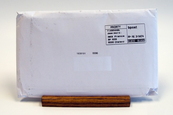
Each month, a deceptively simple envelope arrives from Belgium. Hidden behind its plain exterior lies one of the riches of Catholic publishing, Magnificat. Physically, the book doesn’t promise a great deal. At 4.4″ x 6.6″ and 476 pages, it fits comfortably in my jacket pocket. Weighing only 178 grams, it is light enough to hold in one hand for an extended period. And hold it I do, three times a day.

Magnificat envelope

It would be fair to describe Magnificat as seductive. The seduction begins with the beauty of art. Each month, two artworks are featured. A brief essay comments on the cover art, and an extended essay explores the masterpiece reproduced near the end of the book. In the May 2015 issue, the cover reproduces Adoration by Giuseppe Magni (1869-1956) and the featured artwork is The Ascension of Christ, a terracotta sculpture crafted by Luca della Robbia in 1446 in Florence.

Magnificat_cover

Each day, Magnificat leads the reader through morning prayer, the daily Mass readings and evening prayer. Taking May 1, the Feast of St Joseph, as an example, the reader would encounter:

  • John 14:2, “There are many rooms in my Father’s house….”
  • Psalm 131, “O Lord, remember David and all the hardships he endured…”
  • Revelation 21:3, “…his name is God-with-them.”
  • The Canticle of Zechariah (Lk 1:68-79) “Blessed be the Lord, the God of Israel! He has visited his people and redeemed them….”
  • General intercessions: “You have chosen us as your resting place for ever: grant us peace in your presence.”
  • Acts 13:26-33, “…this message of salvation is meant for you.”
  • Psalm 2: “The Lord said to me: ‘You are my Son. It is I who have begotten you this day.'”
  • John 14:1-6, “Do not let your hearts be troubled. Trust in God still, and trust in me.”
  • Meditation of the Day: a brief essay, “United with Saint Joseph the Worker” by Anthony Esolen.
  • Matthew 6:20-21, “Store up treasures for yourselves in heaven….”
  • Psalm 48, “Why should I fear in evil days the malice of the foes who surround me.”
  • 1 Peter 1:17-21, “If you are acknowledging as your Father one who has no favourites….”
  • The Magnificat, Lk 1:46-55, “My soul glorifies the Lord….”
  • A brief essay on saints who were physically disabled.
  • A two-page essay about Sister Ida Peterfy

During May, one would encounter 46 of the Psalms, various essays and a close reading of the Gospel for the sixth Sunday of Easter. The saints one would meet include St Gilbert of Sempringham (died 1189), St Charles Borromeo (died 1584), St Bede the Venerable (died 735) among many others. Meditations are drawn from St Alphonsus Liguori, Willa Cather, St Catherine of Siena, Pope Francis, Pope Benedict XVI, St Philip Neri, St Symeon the New Theologian and twenty-five other writers.

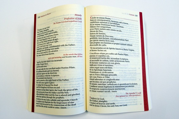
For those who wonder about our Latin heritage, the Kyrie, Gloria and Creed are provided in Latin and English.

Magnificat_02

A short note about the versions. Magnificat in English is available in an American and an International English version. The American version uses the New American Bible while the International version uses the Jerusalem Bible. Since the Canadian lectionary is based on the NRSV translation, I felt free to indulge myself and choose the version which includes “Glory be to the Father…” in the formula I grew up with. If you recognize the reference, you would probably make the same choice.

Magnificat is also available in French and Spanish versions. A subscription to the printed edition includes access to the online version. A iOS app is also available on the rare occasions when the book is not close at hand.

Putting a little pop into the mailbox

I love die-cut mail pieces. They can playful and still enhance the message. When done well, I delight in the creativity and craftsmanship. Here’s a particularly attractive example:

Scotiabank mailing, die-cut wndow envelope, popcorn on top

Die-cut window envelope, 9″ x 5.875″

Who hasn’t enjoyed popcorn and a movie?  They go together like Laurel and Hardy or credit card bills and headaches. I don’t usually open offers for credit cards but the popcorn did the trick. The imagery was carried over to the back of the envelope so that the whole piece was consistent, with a clear call to action on the front and back.

Popcorn_02

The envelope, including the area with the popcorn, appears to have been glued shut before the die cut was applied. The double thickness of the paper gave the popcorn area the strength to retain its shape in the mail and the late cut created a clean edge.

Scotiabank popcorn themed envelope and letter

As expected, the front of the letter carried over the colour scheme and popcorn imagery. The back of the letter, though, was taken up with the usual terms and conditions – a quick trip from the world of movies to the world of banking.

If you look closely, you’ll see that I’ve held onto this piece for more than a year. The artistry hasn’t gone stale.

How Indspire caught and held my attention

I couldn’t resist opening the envelope that the promised a “special gift” for me. It was from an organization I hadn’t heard of — Indspire. Before describing the contents, I’ll take a moment to comment on the envelope.

Fundraising package from Indspire, 8

Fundraising package from Indspire, 8″x5.5″, 62 grams, Addressed Admail.

The obvious thing to note is that the envelope did its job. It convinced me to open the package to examine the contents. At 8″x5.5″ and 62 grams, the package stood out from the rest of the mail that day.  I noted the Addressed Admail indicia in the upper right corner and the sortation information in the window, but that didn’t put me off. The prominent text promising a gift and the colourful images suggesting postcards primed me to expect something special inside.

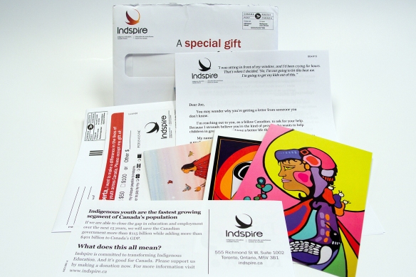
Indspire fundraising package: 4-page letter, buckslip, gift, reply form and postage-paid reply envelope

Fundraising package: 4-page letter, buckslip, gift, reply form and postage-paid reply envelope

The 4-page letter appeared to be the work of a professional copy-writer. It had many of the classic elements. In the upper right hand corner of the first page, a Johnson box featured a moving first-person testimony. The text of the letter was written in a casual, first-person style and began with the sender’s self-introduction. Quickly, it introduced us to Amy and described how education had changed her life for the better. From there, the text carried me through an engaging mix of facts, benefits, testimonies and requests. Interestingly, the page breaks on the first and second page occurred in the midst of a sentence, encouraging me to move to the next page to complete the thought. Finally, in the standard P.S., the writer explained the purpose of the colourful note cards.

The other elements of the package complemented the letter. The buckslip provided talking points about the challenges being addressed. The reply card and envelope provided attractive options for making a donation. The note cards are beautiful and definitely will be used.

Did this mailing do its job? Yes, indeed. I read every word, examined every piece and visited Inspire’s website to learn more. Would an email have had the same effect? Not even close.

Fundraising appeal from a Member of Parliament

What a delight to receive this fundraising appeal in the mail! I don’t often say that about fundraising letters, but this one is special. Even if my name was mangled, somewhat.

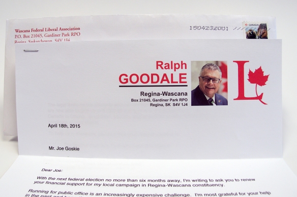
A very welcome letter from Ralph Goodale, a mentor early in my working life.

A very welcome letter from Ralph Goodale, a mentor early in my working life.

Many years ago, during his first term as a Member of Parliament, Ralph Goodale hired me to work in his Ottawa office. It was a turning point for me. I had been employed by the Southeast Community College, setting up adult education classes in forty of the  communities in Ralph’s constituency, Assiniboia. The hours were long and the travel was endless; the deadlines were pressing; the people in the communities always had suggestions for more new classes. Being young, I thought I know what it meant to work hard.

Working for Ralph showed me how much I still had to learn. For every mile I had driven to meet with committees before moving to Ottawa, he had driven ten. For every document I read, every letter I drafted, every phone call I made, he had done twice as much. If I had read a report, he had not only read the report but he had formulated his response and reached out to the stakeholders. Honest, devoted to his constituents, on top of the issues — Ralph was one of the MP’s who improved our public life.

Because of the deep impression he made on me during the two years I worked for him, I have held firm to my faith in our political system. When someone complains about pettiness or corruption on Parliament Hill, I counter with my favourite example of what an MP can and should be. And even now, as the leader has taken the party down a path I can’t follow, I intend to watch the late returns on election night, hoping that Ralph once again graces the House of Commons.

By the way, if you want to get a sense of what’s happening in Regina and many other places, follow Ralph on Twitter: @RalphGoodale.

Hudson’s Bay strikes the right note

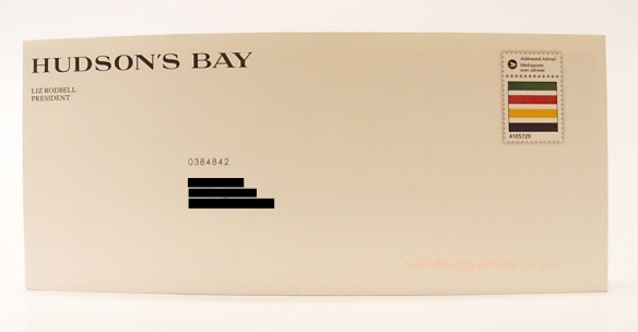
Hudson’s Bay sent a beautiful promotion last week. Restrained typography on a smooth, cream-coloured #10 envelope made it stand out from the other commercial mail. Two features caught my eye. The prominent “Hudson’s Bay” in the upper left corner quietly said “We’re embracing our history.” The custom indicia featuring the Hudson’s Bay blanket reinforced the message.

Unaddressed admail letter from Hudson's Bay

Addressed admail letter from Hudson’s Bay

The letter was sent as a machinable admail piece. Without the extra sortation information in the address block, the piece looked very much like standard lettermail. Inside the envelope, the letter’s formatting and substantial paper reinforced the overall, dignified appearance. Two tipped-on gift cards, in muted colours, completed the offering.

Why did I pay attention to this piece? Was it the apostrophe in the company’s name? A generation ago, iconic stores like Hudson’s Bay became The Bay and Eaton’s became Eaton for political reasons. Does the reapparance of the humble apostrophe say something about the state of our politics?

Maybe it’s the retro theme that stands out: quiet type, the old name, the old blanket. Nothing is much more retro in Canada than a company charted 200 years before the country was founded.