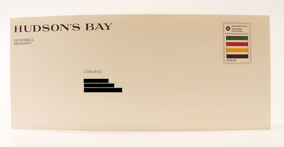
Hudson’s Bay sent a beautiful promotion last week. Restrained typography on a smooth, cream-coloured #10 envelope made it stand out from the other commercial mail. Two features caught my eye. The prominent “Hudson’s Bay” in the upper left corner quietly said “We’re embracing our history.” The custom indicia featuring the Hudson’s Bay blanket reinforced the message.
The letter was sent as a machinable admail piece. Without the extra sortation information in the address block, the piece looked very much like standard lettermail. Inside the envelope, the letter’s formatting and substantial paper reinforced the overall, dignified appearance. Two tipped-on gift cards, in muted colours, completed the offering.
Why did I pay attention to this piece? Was it the apostrophe in the company’s name? A generation ago, iconic stores like Hudson’s Bay became The Bay and Eaton’s became Eaton for political reasons. Does the reapparance of the humble apostrophe say something about the state of our politics?
Maybe it’s the retro theme that stands out: quiet type, the old name, the old blanket. Nothing is much more retro in Canada than a company charted 200 years before the country was founded.

